
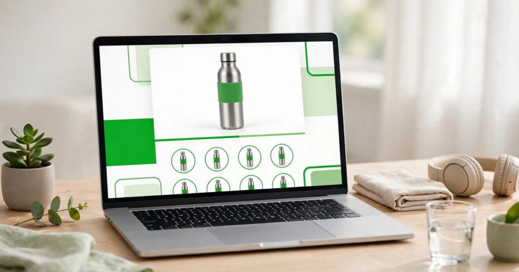
By the Dropship Stair team. Last reviewed: November 2026.
Key takeaways
- Shopify store design ideas are layout and style choices that make it easier for a visitor to trust the store, find a product, and buy it.
- Good design starts with the buyer, not the theme: one clear product, one clear action, and nothing competing for attention.
- Most high-converting stores use the same building blocks: a strong hero, honest product photos, reviews, and a checkout with no surprises.
- Test one design change at a time on mobile first, because most of your traffic arrives on a phone.
Shopify store design ideas work best when each one solves a real buyer problem, so this list skips decoration and sticks to layouts that help visitors decide faster. Steal the layout that fits your products and test it on a phone first.
What makes a Shopify store design convert?
A converting design does three jobs in the first seconds. It tells the visitor what the store sells. It proves the store is real. And it shows the next step. If the hero image is vague, the visitor leaves. If there are no reviews, no contact details, and no clear shipping promise, the visitor leaves. If the buy button hides below three banners and a popup, the visitor leaves. Design is not decoration here. It is the order in which a stranger learns to trust you, and every section on the page either helps that order or breaks it.
Speed matters just as much as looks. A heavy hero video, a dozen app widgets, and oversized photos slow the page. And a slow page loses buyers before they ever see the design. Keep images compressed, keep the homepage sections tight, and check page speed after every design change. Our guide to Shopify store speed optimization shows how to keep a good-looking store fast.
10 Shopify store design ideas that convert
Each idea below works on its own, and most stores combine two or three. Pick the ones that fit your products and your buyers, not the ones that look best in a theme demo.
1. The bold hero with one product
Put one product front and center with a short headline, one benefit, and a single buy button. No carousel. No competing banners. No wall of text. This look suits stores with one hero product or a small catalog, because the visitor understands the store in three seconds. Keep the headline under ten words and make the product photo fill the frame, so the product is the first thing the eye lands on.
2. The video hero that shows the product moving
Use a short, silent, looping clip of the product in use: a jacket moving, a bag opening, a tool working. Video answers the doubts photos cannot, such as size, quality, and how the product behaves in real hands. Keep the clip under fifteen seconds, mute it, and make sure the headline stays readable over it on a phone. This look suits products where motion proves the value. And it fails when the video is just decoration with no product in it.
3. The collection-first homepage
Skip the long brand story and open with your best collections in a clean grid, so buyers reach products in one click. This look suits stores with a wide catalog, because shoppers arrive knowing roughly what they want and hate scrolling past banners to find it. Give each collection a clear photo and a plain name, and put the best sellers first. Our guide to Shopify homepage design best practices shows how to order the sections around the grid.
4. The editorial lookbook
Style the homepage like a magazine: large lifestyle photos, generous white space, and short captions that tell a story about how the product fits a real life. This look suits fashion, home decor, and beauty stores, where the feeling matters as much as the product. It needs good photography, so do not attempt it with supplier photos. One strong lookbook section beats five weak ones, and the buy button should sit one click from every photo.
5. The minimal single-product store
Strip the store down to one product, one page, and one decision. Big photos, a short list of benefits, reviews, and a buy button that never scrolls away. This look suits new products and single-item dropshipping stores, because every element pushes toward the same action. The risk is thin trust. So add a clear returns policy, real reviews, and contact details in the footer to balance the minimal layout.
6. Bold color blocks that guide the eye
Use one strong brand color in blocks to separate sections and pull the eye toward the buy button. A dark green band for the hero, a white band for products, a green band for the guarantee, and the pattern repeats down the page. This look suits stores with a strong brand color and a young audience. Keep it to one accent color plus neutrals. Because two loud colors fight each other and tire the eye fast.
7. The social-proof heavy layout
Put reviews, customer photos, and press mentions where buyers actually look: under the hero, beside the buy button, and in the cart. A product page with five detailed reviews earns far more trust than a page with fifty short ones, so show the detailed ones with photos. This look suits stores with happy buyers and a growing review base. It fails when the reviews look fake, so never show reviews you cannot stand behind. Our guide to Shopify store trust signals covers the signals that matter most.
8. The shoppable social grid
Turn your social photos into a shopping grid on the homepage, where each photo links to the product in it. Buyers who arrived from social media recognize the style at once, and the grid doubles as proof that real people use your products. This look suits stores with an active social presence and photogenic products. Only use photos of real customers or your own shoots, and keep the grid updated. Because a stale feed signals a dead store.
9. The story-led brand page
Give the brand a proper page with a short, honest story: who started the store, why this product, and what the buyer gets that a big retailer cannot offer. Link it from the footer and the main menu, and keep it under 300 words. This look suits handmade, niche, and mission-led stores, where the buyer chooses the maker as much as the product. A story page will not save a weak product page. So fix the product pages first.
10. The mobile-first thumb-friendly layout
Design for the thumb, not the mouse: big tap targets, sticky add-to-cart button, short headlines, and sections that stack cleanly on a narrow screen. Most Shopify traffic arrives on phones, so a layout that looks great on desktop and breaks on mobile is a layout that loses most of its buyers. Test every page on a real phone, not just a resized browser window, and fix anything that needs pinching or sideways scrolling. Our guide to Shopify store conversion rate shows the mobile checks that matter most.
Which design idea fits your store?
The right look depends on your catalog size, your products, and how buyers find you. The table below matches each idea to the store it suits, so you can shortlist two or three instead of copying all ten.
| Design idea | Best for | Needs | Watch out for |
|---|---|---|---|
| Bold hero, one product | Hero product stores | One great photo | Weak headline wastes the space |
| Video hero | Products where motion proves value | Short clip under 15 seconds | Heavy video slows the page |
| Collection-first homepage | Wide catalogs | Clear collection photos | Too many collections overwhelms |
| Editorial lookbook | Fashion, home, beauty | Real lifestyle photography | Supplier photos ruin it |
| Minimal single-product | Single-item stores | Strong reviews and policy | Thin trust without proof |
| Bold color blocks | Strong brand color | One accent color | Two loud colors clash |
| Social-proof heavy | Stores with happy buyers | Detailed reviews with photos | Fake-looking reviews backfire |
| Shoppable social grid | Social-led stores | Fresh customer photos | Stale feed signals a dead store |
| Story-led brand page | Handmade and niche stores | Honest 300-word story | Will not fix weak product pages |
| Mobile-first layout | Every store | Real phone testing | Desktop-only checks miss breakage |
Start with the mobile-first layout, because it is not optional, then add the one idea that fits your products best. A small store with one hero product should pick the bold hero. A fashion store should pick the lookbook. A wide catalog should pick the collection-first homepage. One strong idea, done well, beats ten half-done ones.
What mistakes should you avoid with Shopify store design?
The most common mistake is copying a big brand layout that your store cannot support. A lookbook needs real photography, a social grid needs real customer photos, and a video hero needs a real clip. Without those, the layout looks empty. And an empty layout is worse than a simple one. Build the design around the assets you actually have, not the ones you wish you had.
The second mistake is adding sections to fill space. Every section should answer a buyer question or push toward a purchase, and any section that does neither should go. The third mistake is designing on desktop and never checking the phone. Open every page on a real phone after each change, tap every button, and fix anything that feels cramped. If you are planning a bigger change, read our guide to when to redesign your Shopify store before you start.
Frequently asked questions
What is the best Shopify store design for conversions?
There is no single best design, because the right layout depends on your products and buyers. The patterns that convert share the same bones: a clear hero, honest photos, visible reviews, and a buy button that is easy to find on a phone.
How much does Shopify store design cost?
A theme costs nothing to start with, since Shopify includes free themes like Dawn, and paid themes usually run from $100 to a few hundred dollars once. A custom design from a designer costs more and makes sense only when a theme cannot do what your store needs.
Which Shopify theme is best for design ideas like these?
Dawn is the safest starting point, because it is free, fast, and flexible enough for most of these layouts. Paid themes add ready-made sections for lookbooks, video heroes, and social grids. Pick the theme that already has the sections you need, instead of rebuilding them with code.
How do I make my Shopify store look professional?
Use consistent colors and fonts, real product photos from several angles, a clear shipping and returns policy, and reviews with photos. Keep the homepage short and the navigation simple. Professional is mostly consistency: the same style on every page, with nothing broken or half-finished.
Should I hire a designer for my Shopify store?
Hire one when a theme cannot do what your store needs, or when design is eating time you should spend on products and marketing. For most new stores, a good theme plus the ideas in this article is enough to look professional and convert well.
Shopify store design ideas only work when they match the store behind them. So start with the mobile layout, add the one idea that fits your products, and test it with real buyers. Good design is not the fanciest layout. It is the layout that helps a stranger trust you fast enough to buy. If you want a professional hand with the work, our Shopify store design services can build it for you.
Sources: Shopify Theme Store and Dawn theme documentation, checked November 2026; the Dropship Stair guides linked in this article.