
By the Dropship Stair team.
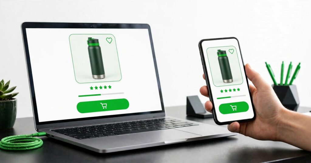
Good Shopify product page design puts information in the order shoppers decide: images, title, rating, price, options, a clear buy button, and short delivery and returns reassurance. The seven ideas below follow that order, and each one removes a reason to leave.
Key takeaways
- Shopify product page design means arranging images, title, rating, price, options, and the buy button in the order shoppers decide, with details and reviews lower down.
- The buy box, with price, options, and the button, should be visible without scrolling on desktop.
- Star ratings and review counts belong right under the title, at the point of decision, not in a tab below the fold.
- On mobile, the add to cart button should sit within the first two screen heights, or stay visible in a sticky bar.
- Test one change at a time, and measure it with real orders, not with opinions.
What order should a product page follow?
Shoppers decide in a fixed order, and the page should follow it. First they look at the images, then they read the title, then they check the rating, the price, and the options, then they look for the buy button. Delivery and returns reassurance comes right after the button, where hesitation happens. The long description, the specs, and the full reviews sit lower down, for the shoppers who want them.
Brand storytelling has value, but it should not stand between a shopper and the buy button. A long brand video above the price pushes the decision further down the page, and many shoppers will not scroll that far. Put the story below the buy box, where interested shoppers can find it and ready shoppers never have to pass it. Our guide to product page copywriting for Shopify covers the words that belong in each part of that order.
How should product images work?
Images do most of the selling, so treat them as the first salesperson on the page. Show the product clearly in the first image, with a clean background and the true color, then add detail shots, a lifestyle shot of the product in use, and a scale shot that shows its size. Three to six images is the right range for most products, and more than eight creates decision fatigue instead of confidence.
Keep the images large and sharp, with zoom that works on a phone, and put the best image first because many shoppers never swipe past it. Add a short video when the product needs to move to be understood, such as clothing, a tool, or a gadget, and keep it under a minute. Order the gallery the way a shopper would inspect the product in a shop: the whole item first, then the details, then it in use.
How do you make price and options easy to read?
Show the price plainly, with any compare-at price used honestly, only when the product genuinely sold at that higher price. If a discount applies, show the before and after numbers so the saving is clear without a calculator. Put the price close to the title and the buy button, because a shopper should never have to hunt for the one number that decides the purchase.
Make the variant pickers just as clear. Show every size and color option, mark sold-out variants as unavailable instead of hiding them, and use color swatches for color choices, because swatches beat text dropdowns for most shoppers. When a shopper picks a color, change the gallery to show that color. When a size is out of stock, say so plainly and offer the nearest size, instead of letting the shopper discover the problem at checkout.
Where should reviews and social proof go?
Put the star rating and the review count right under the product title, and make it clickable so it jumps to the full reviews. That is the point of decision, and a shopper who sees 4.8 stars from 200 reviews trusts the page in a second. A rating buried in a tab below the fold does nothing for the shopper who is deciding now.
Place a handful of recent, specific reviews further down, with verified purchase marks and dates, so shoppers can see people are still buying. Encourage customer photos, because a photo of the product in a real home answers questions no studio shot can. For a new product with no reviews yet, hide the empty rating instead of showing zero stars, and set up a review request flow so genuine reviews build quickly. Our roundup of the best Shopify apps for reviews lists tools that collect and display them.
How do you design a buy button shoppers cannot miss?
Make the add to cart button the highest contrast element in the buy box, large enough to tap easily on a phone, with clear text such as Add to cart. Give it a color that stands out from the page, not one that blends into the background, and keep it above the fold on desktop and within the first two screen heights on mobile. If a shopper has to scroll to find the button, some of them will not bother.
After the click, confirm the action. Change the button to show it is adding, then show a small cart drawer with what was added and a clear path to checkout or back to shopping. Do not force checkout at once, because a shopper who wants to keep browsing will leave if the page pushes them. For subscription products, show the one-time and subscription prices side by side, and make the recurring commitment obvious before the shopper clicks.
How do you answer delivery, returns, and payment questions?
Answer the three questions every shopper asks, right under the buy button: when will it arrive, can I return it, and how can I pay. A short line for each is enough, such as the delivery time, a 30-day returns note, and the payment marks. A shopper who has to open the footer to find the returns policy has already started to doubt the purchase.
Keep the answers short and honest. If delivery takes a week, say a week, because a shopper who learns the truth after paying will not order again. If returns are free, say so, because that removes the last risk. Put the full policies on their own pages and link to them, but keep the short answers where the decision happens. That placement is the difference between a policy page and a conversion tool.
How do you design the page for mobile first?
Most of your traffic will arrive on a phone, so design the page on a phone first and check the desktop version second. Stack the images above the buy box, keep the title and price short, and make the tap targets for variants, quantity, and the button comfortably large. A sticky add to cart bar can help on long pages, as long as it does not cover important content or clash with cookie banners and chat widgets.
Test the page on a real phone, not only in a browser preview. Tap every variant, open the image zoom, add the product to the cart, and start checkout, all with one thumb. If any step feels cramped or slow, fix it before you test anything else. A page that works on a phone will usually work on a desktop, but the reverse is not true. Our guide to SEO for Shopify product pages covers the search side of the same pages, and our Shopify store design ideas show clean layouts to copy.
| Page element | Where it goes | Common mistake |
|---|---|---|
| Images and gallery | Top left on desktop, top on mobile | One dark photo, no detail shots |
| Title and rating | Right under the images, top of buy box | Rating hidden in a tab below the fold |
| Price and options | Under the rating, above the button | Price hidden, sold-out options removed |
| Add to cart button | Highest contrast, above the fold | Gray button, buried below the description |
| Delivery and returns | Right under the button | Buried in the footer only |
| Description and reviews | Lower down, easy to scan | Long story blocking the buy button |
The verdict is simple. The top of the page sells, and the bottom of the page proves. Keep the decision order clean at the top, and put the evidence where shoppers look for it when they need it.
How do you test product page changes?
Test one change at a time, and give it enough traffic to mean something. Change the button color, or the image order, or the review placement, but never all three at once, because a result you cannot explain is a result you cannot repeat. Run the test for at least a week, or until you have enough orders to see a real difference, and write down what changed and what happened.
Measure with Google Analytics 4, tracking the full journey from product view to add to cart to purchase, and check that the events match what actually happens on the store. If a change lifts add to cart but not purchases, the problem sits in checkout, not on the page. If a change does nothing, revert it and try the next idea. A product page is never finished, it is only the best version you have tested so far.
Frequently asked questions
What makes a good Shopify product page?
A good product page follows the decision order: clear images, title, star rating, price, options, a prominent buy button, and short delivery and returns notes. Details and full reviews sit lower down. Every element answers a question the shopper asks before buying.
Where should reviews go on a product page?
Put the star rating and review count right under the title, where the decision happens, and make it clickable to the full reviews. Place a few recent, specific reviews further down with verified purchase marks and dates, and add customer photos when you have them.
How many images should a product page have?
Three to six images is the right range for most products, starting with a clear shot of the whole item, then detail shots, a lifestyle shot, and a scale shot. More than eight images creates decision fatigue. Add a short video when the product needs movement to be understood.
Should I use a sticky add to cart button?
Yes, a sticky add to cart bar helps on long product pages, especially on mobile, as long as it does not cover important content or clash with banners and chat widgets. Keep the button visible, high contrast, and easy to tap with one thumb.
How do I improve product page conversion?
Start with the buy box: images, price, options, and the button in the right order, with reviews near the title and delivery notes under the button. Test one change at a time, measure it in Google Analytics 4, and keep only the changes that lift real orders.
Shopify product page design is not about decoration, it is about order. Put the images, the price, the options, and the button where shoppers look for them, answer the delivery and returns questions where hesitation happens, and let the reviews prove the rest. Test one change at a time, and the page will keep getting better.
Last reviewed: November 2026.